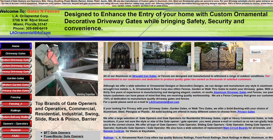
Mistake 1) Overcomplicating things, too much wording
It’s easy to make the mistake of having everything about your business and services on your home page. You want people to find out as much information about you as possible. A survey by Brafton, said the average time spent on a site was 2 minutes, 17 seconds. People won’t stay on a website if it has too much text. You need to grab users attention in the first 15 seconds or they will most likely leave. Another study by Tony Haile of Chartbeat, said it only takes 15 seconds to capture your attention, anything longer users will lose interest.

Above is an example of bad website design. There is too much going on, too much text and it doesn’t portray what they do well. If you want to learn more about getting more traffic to your website you can read this post. https://developerrocket.com/how-to-get-more-search-traffic-when-starting-out-free/
Mistake 2) No Brand Identity/Colour Scheme
Once you have your branding and colours, make sure your websites match and follow the guidelines. A good font can be the difference between a great looking site and an OK one. A great place to find font is https://fonts.google.com/. They list all of their fonts, what goes well with each and lets you download the entire family for free.
A recent study found that adjusting colour, among other elements, can increase conversion by as much as 24% (Read more about the study here). Pick a colour scheme and try to stick to it. From my experience, choose no more than 3 colours on your website, anything more can look overwhelming and distract the user. It’s also worth noting who your target audience is.
- Women tend to not like grey, orange, and brown. They like blue, purple, and green
- Men tend to not like purple, orange, and brown. Men like blue, green, and black.
- Blue is used to build a user’s trust.
- Yellow is mostly for warnings.
- Green is good for environmental and outdoor products.
- Orange is used for fun and to create a sense of haste or impulse.
- Black adds luxury and value.
- Bright primary colours for your call to action.
Source – https://neilpatel.com/blog/psychology-of-color-and-conversions/
Mistake 3) Too pushy
No one likes lots of pop-ups on a website. It annoys the viewer, slows things down and reduces conversions. You should only really have one popup appear at a time. This doesn’t include a cookie policy popup as this is a requirement. Don’t shove deals down customers throats, the best way to convert a person is to build trust and giving them something in return.
If you are going to make a popup, make sure you are offering the user something. If you own an online store, have a newsletter popup when the user scrolls down the page that offers them 10% off their first purchase if they subscribe. This is the perfect intentive to subscribe as they get something out of it.
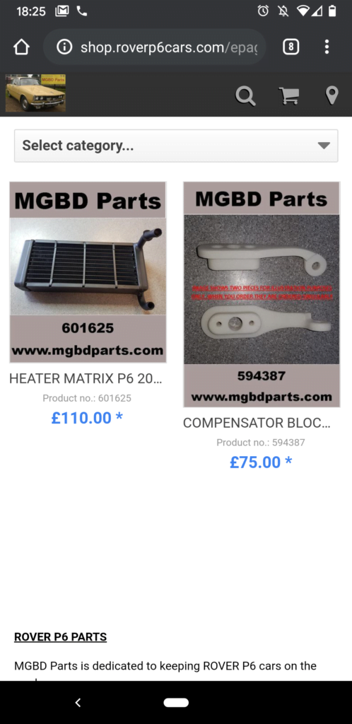
Mistake 4) Poor Mobile Site Experience
Heres some interesting stats:
- As of Q2 2018, smartphones held a 63% share of all retail website visits
- 85% of adults think that a company’s website, when viewed on a mobile device, should be as good or better than its desktop website.
- Mobile devices are projected to comprise 63% of global internet use by the end of 2019
Source: https://www.sweor.com/firstimpressions
The chances are that over half of your website traffic is going to come from mobile users. It’s more important than ever to focus more on making your website fully optimised for mobile. As of 2020, it’s estimated that the number of smartphone users is around 3.5 billion so if you don’t make sure of this then you are missing out on a lot of potential traffic to your site.

Want to learn more?
If you want to learn more about designing a website please don’t hesitate to get in touch with me. We have tonnes of blog posts to learn more about Branding, getting more traffic for free to your site, Search Engine Optimisation and more.
Developer Rocket is a Website Design, Branding, SEO and Hosting business based in Chatham, Kent but working with clients across the country and the World.


