Websites are a must-have for all businesses. You can no longer have a business that runs just through word of mouth, it must have an online presence if you want it to grow. This article will go through 10 website optimisation rules that you should follow if you want to drive traffic, be helpful to the user and make sure they can find what they need.
Before you start reading I’d like to recommend a book that really changed the way I see my business. Will it Fly by Pat Flynn, this book helps you assess your idea before committing to it, it has helped so many including me! So, if you’ve had loads of ideas and don’t know what one to commit to, this is the book for you!
Clear value and purpose
Research at Microsoft has shown that on average people will visit a website for 10-20 seconds before leaving and pressing the back button. When a user first enters your site, you need to grab their attention within the first 10 seconds or there’s a big chance they’ll leave. You need to make sure that the purpose and the value you provide is clear straight away. In web design “bounce-rate” is the term used to show how many users enter your website and then leave very shortly after. You need to make sure your bounce rate is low, meaning that the users are getting something from your site. To show the users that your website is worth staying it needs to tell them what your business does and how it can help them.
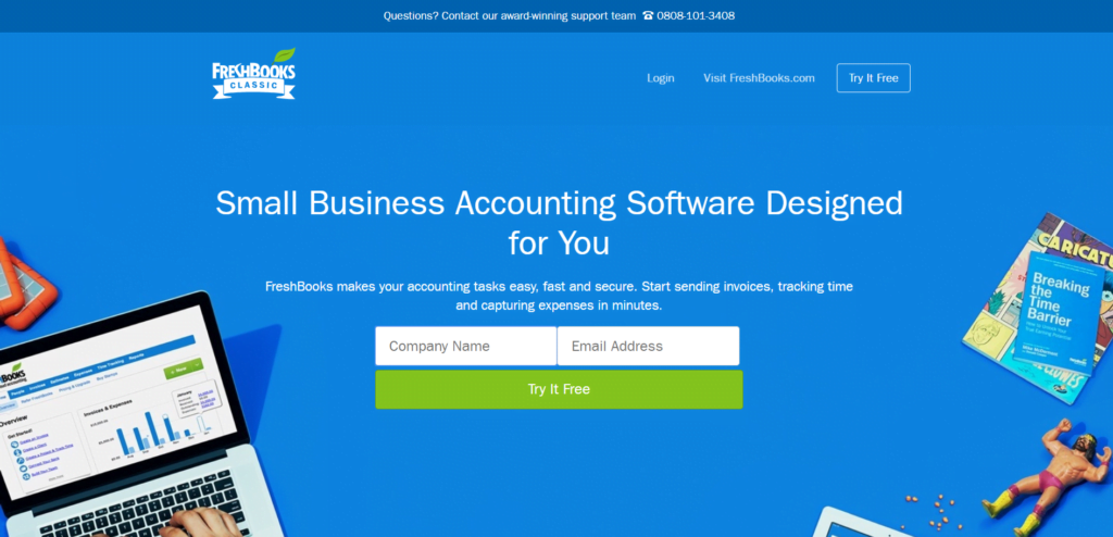
The image below shows a great example of a homepage. This is FreshBooks, it may have changed when you visit but you can see here straight away the website shows exactly what it does and a call to action to try it for free using a simple sign-up form. This is the perfect example of how to get customers!

Loading time
As mentioned above people have very short attention spans! If your site doesn’t load fast people will simply leave and forget about your business. Research by Google has shown that if your web page takes more than 3 seconds to load then your bounce rate will increase by 32%. If it takes 10 seconds, then your bounce rate could increase by 123%. So, it is very important to make sure your site is quick and responsive. One way of doing this is to make sure that the images on your site aren’t too big or reduce the quality of the images, this means the browser can load your site quicker. There are lots of tools and plug-ins online that can give you some useful insights into page loading times and others can reduce the image sizes.
Call to action
When someone visits your site for the first time they should be attracted to what you are offering. There should be no question as to what they should do next. A call to action refers to something that a visitor should do on your site. This could be signing up for a newsletter, getting 40% off if you buy something now or even simply showing them what you are offering on another page. A big tip for this is to make sure the call to action is in the top part of your website site without the need for scrolling. This makes sure it is the first thing the user will see when they enter your site. This call to action should be shown multiple times across the homepage to make sure they see it.
Prove what you can do or sell
Customers aren’t going to use your service if you have no proof that it works or that people like your product. If you’re a graphic design company, show what designs you have made, if you sell cars show what customers have said about them in testimonials. This is a great way of getting customers as people will follow the crowd if others have used or bought your products. Studies have shown that 79% of people trust online reviews and even more trust reviews from real people. Your potential customers should trust what you are selling to them, this trust comes from others!
Make sure your website is easy to scan
Studies have shown that only 16% of people read online text word for word, meaning that most people just scan it. Your site needs to be scannable so even if your visitors don’t miss the vital information. A few very simple, yet very effective ways to make your website scannable is:
- Use short sentences
- Use lists
- Show important bits in bold or underline
- Separate information using headings and paragraphs.
An even better way of making sure people are getting what they need is simply using images. If you are an online shop simple have an image of shoes for the shoe section and hats in the hat section. It’s that simple. No one wants to read paragraphs of information, most will just leave the page.
Show images of people in your business
This is important as people feel reassured that your business is run by people and is not just a faceless online thing! This also works with showing your customers, having pictures of a happy customer with your product will attract others to it more. If you are a freelancer (like me!) having a picture of your face will show people who you are, gives them an idea of your personality and shows that you are friendly, inviting them into your business. This technique instantly builds trust.
What makes you different?
If you have a business, the chances are that someone already has the same idea or service as you. You need to stand out, what makes your business better than there are? If you are just starting out, then this gives you a great opportunity to look at other similar businesses in your space and see what they do. You can then see what you can do better and use it to your advantage. If you are a well-established business but your website is not yet up to scratch this can still be used, you need to market your website in a way that makes you stand out.
Easy to use
If your website isn’t easy to use, then people simply won’t use it. A big issue that I see with small businesses in my area is that they try and cram everything they do into the navigation bar. This confuses the customer by giving them too much choice. A better way of doing things is to categorise pages and then have sub-menus in each sub-category. Another big issue that I come across too much is making information hard to find. Some websites don’t have a home button making it difficult to find where you are on the site, it is vital that customers can get to where they need to be in as few clicks as possible.
Original images
It is obvious when a website has used stock images of people that clearly aren’t part of their business. This makes the site look cheap and tacky. Using your own images of work done and of your own staff gives your site and business more personality. Stock icons and images are also widely used on websites because they come free with the web builder they are using, this again looks cheap. It is always best to use original photography because your customers can tell.
Make sure everything works!
I cannot tell you how many times I have clicked on a URL from a business Facebook page and the link doesn’t work. Or I have clicked on a page on a website and it just takes me back to the homepage when is supposed to take me to the about page! This is a sign of poor design and lack of care. When your website doesn’t work it reflects badly on your business. Before launching your website make sure that all the links work, all the pages work, social links go to the right place and just generally make sure that everything is in order. This will pay off in the end when you have a great-looking website that does exactly what it is supposed to do.
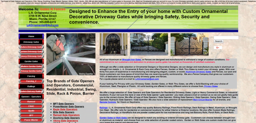
The website to the left is the perfect example of poor website design (if your website looks like this pleeeeeasssee contact me). It shows way too much information in a small font that no one will ever read. It doesn’t make it clear what exactly they do. No call to action. The navigation bar is overloaded. The only good they are going here is that they use, what seems to be, their own images. Don’t be this website!
So, there you have it! My 10 tips for making sure your website is the best it can be. It is a lot of effort at first, but it is worth it. Developer Rocket always follows these tips when making a website, they are simple but work! If you need a website or a website redesign, please get in contact!
If you have any questions or more tips please leave them in the comments, have a good day!


A fantastically helpful and practical article – thanks for sharing,,
Frances Barrone
Confidence and Clarity Coach – Live you life, Love your work!